This review is based only on the chart image provided for Protean eGov Technologies, NSE: PROTEAN, on the daily timeframe. It does not assess the company’s financial statements, valuation, business outlook, news, management, or broader market conditions. It also does not provide a recommendation to buy, sell, or hold the security.
Technical charts can show past price behaviour and market activity, but they cannot establish what the price will do next. The levels below are therefore best treated as areas for further study rather than fixed predictions.
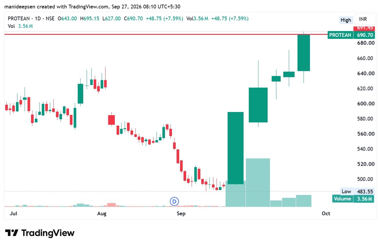
The chart carries the date September 27, 2026, and shows the latest daily candle with an open of ₹643.00, a high of ₹695.15, a low of ₹627.00, and a close of ₹690.70. The stated daily change is +₹48.75, or +7.59%, with volume of 3.56 million.
The Main Chart Structure
The chart shows a clear change in price direction over the displayed period. During July and early August, the price moved mostly within a broad range. It reached the area near ₹620–₹650 at several points, but that strength did not continue at that stage.
After the early August area, the chart shows a decline. Price moved from the upper ₹500s toward the ₹500 area and later reached a displayed low of ₹483.55.
The price then formed a base close to the ₹485–₹500 region. After that base, the chart shows a strong upward move. The price first moved above ₹500, then passed ₹580, ₹620, and ₹640. The latest candle reached ₹695.15 before it closed at ₹690.70.
This creates a simple chart sequence:
| Chart area | Approximate price zone | Chart observation |
|---|---|---|
| Major low | ₹483.55 | Lowest price shown on the chart |
| Base area | ₹485–₹500 | Price held near this region before the sharp rise |
| Earlier support/resistance | ₹580–₹590 | Previous price area before the stronger rise |
| Major prior zone | ₹620–₹650 | Important area before the latest advance |
| Current resistance area | ₹690–₹700 | Latest price test |
| Latest close | ₹690.70 | Close near the upper end of the latest candle |
These zones are approximate. They come from the visible chart structure and should not be treated as exact technical levels.
The Earlier Decline
The chart does not show a straight upward path. Before the latest rise, Protean had a period of weakness.
After the price reached the ₹630–₹650 area in late July and early August, several candles showed lower prices. The stock then moved toward the ₹550 area. A further decline took it close to ₹500.
This part of the chart is important because it shows that the stock had faced supply at higher prices before the later reversal.
The displayed low is ₹483.55. After that level, price stopped its previous decline and began to form a base.
A base does not guarantee a future rise. It simply describes a period where the earlier decline lost some of its force and price spent time near a lower zone.
The Reversal From ₹483.55
The most important feature of the recent chart is the change from the September low to the latest price.
The displayed low is ₹483.55, while the latest close is ₹690.70. The difference is ₹207.15.
Based on those two displayed values, the rise from the low to the latest close is about 42.8%. The latest intraday high of ₹695.15 is about 43.8% above ₹483.55.
This is a large price move over the portion of the chart shown.
The move also contains several large green candles. Such candles show strong upward price movement for those sessions. They do not, by themselves, prove that the move will continue.
The size of the candles does show that market activity became much stronger after the price reached the lower ₹500 area.
The Importance of ₹620–₹650
The ₹620–₹650 region deserves close attention because it appears several times on the chart.
Before the decline, price traded around this area. Later, after the reversal from ₹483.55, the price moved back into this zone.
The recent candles then pushed above ₹640 and moved toward ₹690.
From a basic chart perspective, an old resistance area can sometimes act as support after a clear move above it. However, this change is not automatic. Price must remain above the area for the chart to show that the old resistance has gained support value.
For this reason, the ₹620–₹650 region can be treated as an important reference zone rather than one exact number.
The upper part of this zone, near ₹640–₹650, has special relevance because the latest candle opened at ₹643.00.
The Latest Candle
The latest daily candle has the following values:
| Item | Value |
|---|---|
| Open | ₹643.00 |
| High | ₹695.15 |
| Low | ₹627.00 |
| Close | ₹690.70 |
| Daily change | +₹48.75 |
| Daily change percentage | +7.59% |
| Volume | 3.56M |
The candle opened at ₹643.00 and closed at ₹690.70. Therefore, the close was substantially above the open.
The candle also reached ₹695.15, which places the high close to the ₹700 area.
The low of ₹627.00 is also useful. It shows that price moved below the open during the session before the strong close near the top of the daily range.
The close at ₹690.70 was only ₹4.45 below the day’s high of ₹695.15. This means the close remained close to the upper end of the daily range.
That is a visible sign of strong price action for that particular session. It is not, by itself, proof of future strength.
The ₹690–₹700 Area
The most obvious short-term reference area on the chart is now ₹690–₹700.
The latest high is ₹695.15, and the close is ₹690.70. Therefore, the stock has already reached this area but has not yet shown a clear close above ₹700 on the supplied chart.
A move above a round-number area such as ₹700 can attract attention because traders often use round prices as reference points. However, a brief move above a level and a sustained move above it are different events.
For chart analysis, the reaction around ₹690–₹700 may therefore provide useful information.
If price remains above this area after a clear move above it, the chart structure could show further strength. If price repeatedly fails near this area and falls back toward lower support zones, the chart could show a period of consolidation or correction.
Neither scenario can be confirmed from the current chart alone.
Volume and Market Activity
Volume provides another important part of the chart.
The chart shows a large rise in volume during the early part of the recent upward move, especially around the large candle from the ₹490 area toward the upper ₹500s and the following advance.
The latest session also shows volume of 3.56M.
Higher volume during a large price move can indicate stronger market participation during that session. It can add importance to a price move because more shares changed hands.
At the same time, volume cannot tell us by itself whether future price action will be positive or negative. High volume can appear during both strong advances and strong declines.
Therefore, the volume should be read together with price and support or resistance areas.
Important Support Areas
Based on the visible chart, several zones can be used as reference points.
The first area is around ₹640–₹650. This is close to the latest candle’s open and also sits near the recent breakout area.
The second area is around ₹620–₹630. The chart shows earlier price activity near this region, so a return here would provide useful information about the strength of the recent move.
The third area is around ₹580–₹590. This area appears close to an earlier major price zone before the stronger advance.
The lower major area is around ₹500, with the actual displayed low at ₹483.55.
These should not be treated as precise stop-loss levels or guaranteed support points. They are simply visible zones from the supplied chart.
| Reference zone | Possible chart role |
|---|---|
| ₹690–₹700 | Immediate resistance area |
| ₹640–₹650 | First important support/reference area |
| ₹620–₹630 | Secondary support/reference area |
| ₹580–₹590 | Deeper support/reference area |
| ₹500 | Major historical reference area |
| ₹483.55 | Displayed chart low |
What Would Strengthen the Chart
From a purely technical perspective, continued strength above the ₹690–₹700 region would provide additional evidence that the latest advance has moved beyond the visible resistance area.
A clear daily close above this region would be more meaningful than a temporary intraday move above it.
A later price test of the same region could also provide useful information. If price moves above the zone, returns toward it, and then finds support there, the chart structure would look different from a simple one-day price spike.
This is a description of chart behaviour, not a forecast.
What Would Weaken the Chart
The recent rise has been sharp, so a decline after the latest candle would not automatically mean that the larger reversal has failed.
A move back toward ₹640–₹650 could simply represent a normal price correction. The reaction at that area would provide more information.
A deeper move toward ₹620–₹630 would indicate that more of the recent advance has been given back.
A sustained move below the recent support areas would weaken the short-term structure further. A return toward ₹580–₹590 would place the price closer to an earlier part of the advance.
A major loss of the lower base near ₹500, and especially the displayed low of ₹483.55, would represent a much larger change to the structure shown on this chart.
Again, these are chart-based conditions, not predictions.
Risk From the Sharp Price Move
The recent rise deserves attention because of its speed.
From ₹483.55 to ₹690.70, the stock has risen by about 42.8% based on the displayed prices. The latest daily rise alone was 7.59%.
A rapid move can create wider daily price ranges. It can also produce sharp pullbacks even when the broader chart remains strong.
For that reason, a person who studies this chart should avoid treating the latest candle as a guarantee of continued price appreciation.
The chart gives useful information about past price behaviour, but it does not provide information about future corporate results, regulatory changes, market conditions, liquidity, or unexpected events.
Simple Scenario Framework
The chart can be viewed through three basic scenarios without assigning a prediction to any one of them.
| Scenario | Chart condition | What it could indicate |
|---|---|---|
| Strength | Price holds above ₹690–₹700 after a clear break | Resistance may have weakened |
| Consolidation | Price moves between roughly ₹640 and ₹700 | Market may pause after the sharp rise |
| Correction | Price falls below ₹640–₹650 and tests ₹620–₹630 | Recent momentum may have weakened |
These scenarios are not forecasts. They are simple ways to understand how different price reactions could change the chart structure.
Overall Technical Reading
The supplied daily chart shows a clear change from a prior decline to a strong upward move.
The most important fact is the transition from the ₹483.55 low to the ₹690.70 close. The price has crossed several earlier zones, including the ₹580–₹590 and ₹620–₹650 areas.
The latest candle is also notable because it moved from ₹643.00 to ₹690.70, reached ₹695.15, and closed close to the day’s high. Volume stood at 3.56M.
At the current point shown on the chart, ₹690–₹700 is the key upper reference area. Below it, ₹640–₹650 and ₹620–₹630 are the more important areas to watch from the chart structure.
The chart therefore shows strong recent upward momentum, a major reversal from the ₹483.55 area, and a fresh test of the ₹690–₹700 zone. It does not, on its own, establish whether the stock will continue higher, move sideways, or correct.
Any investment or trading decision would require additional information beyond this chart, including the person’s objectives, risk capacity, position size, valuation view, company fundamentals, and current market conditions.
FAQs About the Protean Chart
1. What does the Protean chart show?
The chart shows Protean eGov Technologies (NSE: PROTEAN) on a daily timeframe. It covers the price movement from July through late September 2026. The chart shows a decline toward ₹483.55, followed by a strong upward move toward ₹690.70.
2. What is the latest closing price shown?
The latest closing price is ₹690.70. The stock closed ₹48.75 higher, which represents a daily change of +7.59%.
3. What was the latest day’s high?
The latest daily high was ₹695.15. This places the stock close to the ₹700 price area.
4. What was the latest day’s low?
The latest daily low was ₹627.00. The large difference between the day’s low and high shows that the stock had a wide daily price range.
5. What was the latest day’s opening price?
The stock opened at ₹643.00 and closed at ₹690.70. The close was therefore well above the opening price.
6. What is the major low visible on the chart?
The lowest displayed price is ₹483.55. This level appeared during the decline before the sharp upward move.
7. How much has the stock risen from ₹483.55 to ₹690.70?
Based on the prices shown on the chart, the increase is approximately 42.8%. This represents a substantial move from the displayed low to the latest close.
8. Does the chart show a trend reversal?
The chart shows a clear change in price direction. Price first declined toward ₹483.55 and later moved strongly upward through several higher price zones. Whether this becomes a longer-term trend reversal cannot be established from this chart alone.
9. What is the most important resistance area?
The ₹690–₹700 area is the most visible immediate resistance zone. The latest candle reached ₹695.15, but the chart does not show a daily close above ₹700.
10. Why is ₹700 important?
₹700 is a round-number price level located just above the latest high of ₹695.15. Round numbers can serve as common reference points in market analysis, although the importance of any level depends on actual price behaviour around it.
11. What is the first important support area?
The ₹640–₹650 area is an important reference zone. It is close to the latest opening price of ₹643 and also sits near the area from which the stock made its latest strong advance.
12. What is the next support area below ₹640–₹650?
The next important area visible on the chart is approximately ₹620–₹630. Earlier price action occurred around this region, which makes it useful for chart analysis.
13. Is ₹580–₹590 also important?
Yes. The ₹580–₹590 area appears as another historical reference zone on the chart. A move toward this area would represent a deeper retracement of the recent advance.
14. What does the volume of 3.56M mean?
The latest session shows volume of 3.56 million. The chart also shows a noticeable rise in volume during the recent upward move. Higher volume means more shares changed hands during those sessions. Volume alone, however, cannot establish the future direction of the stock.
15. Does high volume confirm a further rise?
No. High volume can support the significance of a price move, but it does not guarantee that the price will continue in the same direction. Price, volume, support, resistance, and subsequent candles need to be considered together.
16. What would make the chart look stronger?
From a technical perspective, a clear daily move above ₹690–₹700, followed by price that remains above this region, would provide further evidence of strength in the chart structure.
A later test of the same area that holds as support would provide additional technical information.
17. What would weaken the current setup?
A move back below ₹640–₹650 would weaken the immediate short-term structure. A further decline below ₹620–₹630 would show that more of the recent advance has been given back.
These levels are chart references, not guaranteed support levels.
18. Is the stock overextended on this chart?
The price has risen sharply from ₹483.55 to ₹690.70, a move of about 42.8%. The latest session also gained 7.59%. This indicates a strong and relatively fast advance.
Whether that makes the stock “overvalued” cannot be determined from the chart alone. A valuation assessment would require company financial data and other fundamental information.
19. Does the chart provide a target price?
The supplied chart does not provide a confirmed future target. It mainly provides visible support and resistance areas.
The immediate upper reference is around ₹690–₹700. What happens after that area would provide more information about the next phase of price action.
20. What is the simplest way to read this chart?
The simplest description is:
Decline → low near ₹483.55 → base → sharp reversal → move through ₹580–₹590 → move through ₹620–₹650 → test of ₹690–₹700.
The latest chart therefore shows strong recent upward momentum, but the stock is now close to a clearly visible resistance area. The next price reaction around ₹690–₹700, together with the behaviour around ₹640–₹650, would be important for understanding the evolving chart structure.