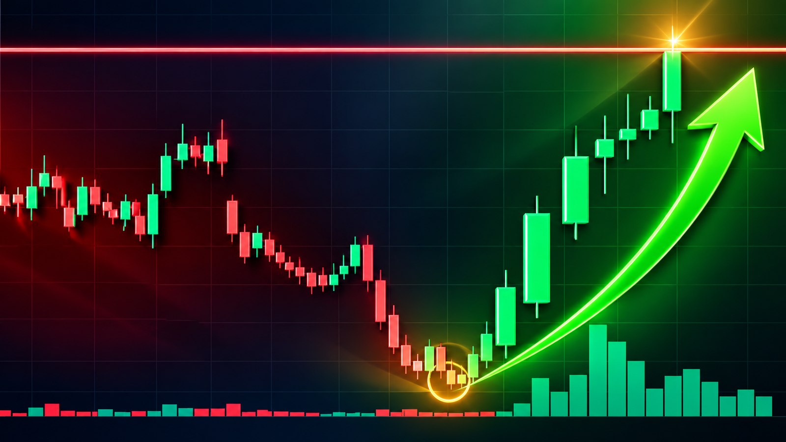
A candlestick chart is a simple way to see how the price of something changed over a certain period. It can show the price of a stock, crypto asset, currency, or another market asset.
At first, a candlestick chart can look hard to understand. You may see many red and green shapes, thin lines, and different sizes. However, each candle gives you a small amount of basic information. Once you know what that information means, the chart becomes much easier to read.
Each candle shows four main prices. These are the open, high, low, and close.
The open is the price at the start of the time period. The high is the highest price reached during that period. The low is the lowest price reached during that period. The close is the price at the end of the period.
For example, if you look at a one-hour chart, one candle represents one hour. That one candle tells you the price at the start of the hour, the highest price during the hour, the lowest price during the hour, and the price at the end of the hour.
The Four Prices in One Candle
Every candle tells a small story about price.
Suppose a stock starts at $100. During the next hour, it reaches $108. It also falls to $97. At the end of the hour, it closes at $105.
The open is $100. The high is $108. The low is $97. The close is $105.
A single candle can show all four of these prices.
The thick part in the middle is called the body. The thin lines above and below the body are called wicks. Some people also call them shadows.
The body shows the difference between the open price and the close price. The wicks show the prices that the asset reached during the period but did not hold at the close.
This is the basic structure of a candlestick. Once you understand this part, the rest becomes much easier.
Green and Red Candles
Most charts use green and red candles.
A green candle means that the price closed higher than it opened. In simple terms, buyers pushed the price up during that period.
For example, if the price opens at $100 and closes at $105, the candle is usually green. The bottom of the body shows the open price, while the top of the body shows the close price.
A red candle means that the price closed lower than it opened. In this case, sellers pushed the price down during that period.
For example, if the price opens at $100 and closes at $95, the candle is usually red. The top of the body shows the open price, while the bottom of the body shows the close price.
The colors can be different on some chart platforms. One platform may use green and red, while another may use different colors. So it is always good to check the chart settings before you read it.
The main idea is simple. A green candle means the close was above the open. A red candle means the close was below the open.
What Is the Body?
The body is the thick part of a candle.
It shows the distance between the open and the close.
A large green body means there was a strong move from the open to the close. A large red body means there was a strong move down from the open to the close.
A small body means the open and close were close to each other.
The size of the body can give you an idea about the strength of the price move. However, you should not make a decision based on the body alone. You also need to look at the wicks, the trend, the price level, and the candles around it.
A candle has more meaning when you look at it as part of the full chart.
What Are Wicks?
The thin lines above and below the body are called wicks.
The upper wick shows how high the price went during that period. The lower wick shows how low the price went.
Imagine a stock starts at $100. It moves up to $110, but later falls back and closes at $103. The candle will have an upper wick because the price reached $110 but did not stay there.
A long upper wick can show that sellers pushed the price back down after buyers pushed it higher. This can suggest that the market did not accept those higher prices.
A lower wick can tell a similar story in the opposite direction.
Suppose the price falls from $100 to $90, but later buyers push it back up and the candle closes at $98. The candle will have a long lower wick.
A long lower wick can show that buyers came in after the price fell. It can suggest that the market did not accept those lower prices.
A long wick does not always mean that the price will reverse. It is simply one piece of information that can help you understand what happened.
Why One Candle Is Not Enough
One of the most important things to remember is that you should not read one candle by itself.
A single candle does not tell you what will happen next.
For example, a candle with a long lower wick may show strong buying activity. But that does not mean the price must rise after it.
The same candle can have a different meaning based on its place on the chart.
A long lower wick near a strong support level can be more useful because buyers may have defended that price area. The same candle in the middle of a quiet market may not mean much.
This is why you should look at the candle, its location, the overall trend, and the other candles around it.
A useful way to think about a chart is this: the candle gives you a small part of the story, while the full chart gives you the bigger story.
Understanding Doji Candles
A doji is a candle where the open and close are very close to each other.
The candle may have a very small body, while its upper and lower wicks can be larger.
A doji often shows that buyers and sellers were close to equal during that period. Neither side had clear control by the time the candle closed.
This can mean uncertainty or indecision.
A doji does not automatically mean that a price reversal will happen. It only tells you that the market had some uncertainty during that period.
The place of the doji matters. A doji after a strong price move may deserve more attention than a doji in the middle of a quiet market.
You should always look at the candles before and after it before you decide what it means.
Understanding a Hammer
A hammer is a candle with a small body and a relatively long lower wick.
It often appears after a price decline.
The idea behind a hammer is easy to understand. Sellers pushed the price down, but buyers came back and pushed the price higher before the candle closed.
This can show that buyers have started to fight back.
A hammer near a support level can be more interesting because the support area may already have a history of buyer interest.
However, a hammer is not a guarantee of a price rise. It is better to wait for more evidence before making a decision.
Understanding a Shooting Star
A shooting star is a candle with a small body and a long upper wick.
It can appear after a price rise.
The price moves higher during the period, but sellers push it back down before the candle closes.
This can show that buyers tried to push the price higher but could not keep control.
A shooting star near a resistance level may be more important because that level may already have a history of seller pressure.
Again, a shooting star is not a guaranteed signal of a fall. It is simply a sign that can help you understand what happened.
What Is a Trend?
Before you study individual candle patterns, you should understand the basic trend.
A market can move up, move down, or move sideways.
An uptrend usually has higher highs and higher lows. This means the price reaches new high points and also holds higher low points as time passes.
A downtrend usually has lower highs and lower lows. The price reaches lower high points and lower low points.
A market can also move sideways. In this case, the price stays inside a fairly clear range instead of moving strongly up or down.
The trend matters because the same candle can mean different things in different situations.
A bullish candle during an uptrend may support the current trend. The same candle during a strong downtrend may not have much importance.
This is why you should first ask yourself what the larger trend looks like.
Support and Resistance
Support and resistance are two important ideas that can make candlestick charts easier to understand.
Support is a price area where buyers have often appeared in the past. The price may fall toward this area and then move back up.
Resistance is a price area where sellers have often appeared. The price may rise toward this area and then move back down.
Imagine a stock often finds buyers near $100. If the price falls toward $100 again and creates a candle with a long lower wick, that may suggest that buyers are defending the area.
Now imagine that the same stock often struggles near $120. If the price reaches $120 and creates a candle with a long upper wick, that may suggest that sellers are defending the area.
Support and resistance do not have to be exact numbers. They can be price zones.
The key idea is to look at where the candle appears. A candle near an important price area can be more useful than the same candle in a random place.
Why Timeframes Matter
Candlestick charts can use different timeframes.
A one-minute chart has one candle for each minute. A five-minute chart has one candle for each five-minute period. A fifteen-minute chart has one candle for each fifteen-minute period.
You can also use one-hour, four-hour, daily, or weekly charts.
A daily candle represents one trading day. A weekly candle represents one week.
The same stock can look different on different timeframes.
For example, a stock may have a strong long-term uptrend on its daily chart but a short-term fall on its fifteen-minute chart.
Both things can be true at the same time.
For this reason, it can help to look at a higher timeframe first. You can then move to a lower timeframe if you need more detail.
The Role of Volume
Candles tell you what happened to price. Volume tells you how much market activity took place.
For example, a large green candle with high volume can show that many market participants took part in that price move.
A large green candle with very low volume may tell a different story.
Volume does not prove that a price move will continue. However, it can add useful information to your view of the chart.
If price moves strongly and volume also rises, the move may deserve more attention.
You should still avoid making a decision based on volume alone. Price, trend, support, resistance, and the wider chart all matter.
How to Read a Chart Step by Step
When you open a candlestick chart, start with the timeframe.
Ask yourself whether you are looking at a one-minute chart, a fifteen-minute chart, a one-hour chart, a daily chart, or another timeframe.
Next, look at the overall trend.
Ask whether the price is moving up, moving down, or staying in a range.
After that, look for important support and resistance areas. Check where the price has turned around several times in the past.
Then look at the latest candles.
Check the size of their bodies. Look at their upper and lower wicks. See whether they are green or red. Compare them with the candles before them.
After that, check volume if it is available.
Finally, ask whether there is enough confirmation for your idea. Do not assume that one candle can tell you exactly what will happen next.
This process can help you read a chart without rushing to a conclusion.
Candlesticks Tell a Story
One useful way to understand candlesticks is to think of buyers and sellers as two sides of a conversation.
A large green candle can show that buyers had more control during that period.
A large red candle can show that sellers had more control.
A long upper wick can show that buyers pushed price higher, but sellers pushed it back down.
A long lower wick can show that sellers pushed price lower, but buyers pushed it back up.
A small body can show that neither side had clear control by the end of the period.
When you put several candles together, you can start to see a larger story.
That story becomes even clearer when you add trend, support, resistance, and volume.
Candlestick Patterns Are Not Guarantees
It is very important to remember that candlestick patterns do not predict the future with certainty.
A hammer can appear and the price can still fall.
A shooting star can appear and the price can still rise.
A doji can appear and the price may continue in the same direction.
The market can change for many reasons. News, company results, economic data, interest rates, investor mood, and many other factors can affect price.
Candlestick patterns are best treated as clues, not promises.
Good chart reading comes from looking at several pieces of information together rather than searching for one perfect candle.
The Main Idea to Remember
Candlestick charts become much easier once you understand what each candle shows.
The body shows the difference between the open and close.
The upper wick shows how high the price went.
The lower wick shows how low the price went.
A green candle usually means the close was above the open.
A red candle usually means the close was below the open.
A doji often shows uncertainty because the open and close are close together.
A hammer can show that buyers fought back after a price fall.
A shooting star can show that sellers pushed back after a price rise.
The trend tells you the larger direction of price.
Support shows a price area where buyers may appear.
Resistance shows a price area where sellers may appear.
Volume shows the level of market activity behind a price move.
The most useful habit is to avoid looking at any one candle alone. First look at the larger trend. Then look at important price areas. After that, study the candle and its place on the chart.
Once you get used to this process, candlestick charts will start to feel much less confusing. You do not need to memorize dozens of patterns at the start. Learn the basic candle structure first, understand price direction, learn support and resistance, and then add a few simple patterns.
The goal is not to guess the next candle perfectly. The goal is to understand what price did, why the candle may matter, and what other information supports your view.
That is the basic foundation of candlestick chart reading.
ALSO READ: IPO Valuations: What Investors Must Ask